Tuesday, December 30, 2008

Setting up your own Web site: Part two

When it comes to setting up your own Web site, this much is clear--it's easier than you think. It all begins with getting a firm handle on the focus and intent of your Web site, and pulling together compelling content (see my earlier post here). The next step is to shop for online services that will help you book your domain name, and actually host your Web site. Let's see how this works:

Booking the domain name: Quite simply, the domain name is the name of your Web site. The first thing you'll need to do is check whether it is available. To do so, you can head over to one of hundreds of available Domain Registrars--these are authorized services that sell domain names. Some of the more popular ones are Network Solutions, Act Now Domains or Register.com. All you need to do is type in your preferred site name in the search field, and you'll find out whether it taken or not. When you find a name that's available, you choose the duration for which you want to book the domain name (ranging from a couple of months to several years--the longer you book it for the cheaper it works out). All domain registrars accept payment by a secure credit card transaction.
While deciding a domain name, remember to keep it short, simple and easy to remember. Also, you should preferably to choose a '.com' URL instead of '.org' or '.biz', as most people are accustomed to remembering the former.

HostMonster hosting featuresHosting your Web site: You will now need to select your Web site's home! Web hosting providers offer several plans (just like your cell phone operator, for example), that consist of a selection of hosting specifications. Just like a home maker shopping for a house, you'll need to consider these specifications before deciding on where you want to host your Web site. These factors include:

  • How much and what type of content do you plan to host? Depending on what your Web site consists of, you could require a few megabytes to several gigabytes of storage space. Look out for how much hosting space is offered and compare this with your requirements.
  • Do you know how to design and build a Web site, or would you like to work with pre-created templates? If you have Web design and coding skills (knowledge of Microsoft FrontPage or Adobe DreamWeaver, HTML programming, CSS, PHP and the like), you will most likely be designing your Web site on your computer, and then uploading it subsequently. If Web designing is new to you (and  you don't want to be bothered with the nitty-gritties), look for a hosting provider that offers 'Site Design' or 'Site Builder' capabilities. Here, you can access hundreds of pre-created Web site templates, where all you need to do is dump your content into these canned Web sites and you're ready to go. While this approach might limit your customization options, it is the quickest and simplest way to get up and running. Also remember that this convenience might come at a price premium.
  • How much site traffic do you expect? If you're setting up a commercial Web site that you plan to promote heavily, you will most likely have plenty of traffic coming to your Web site. hosting providers offer different 'bandwidths', which is the amount of data transfer they allow to and from your Web site per month. The greater the bandwidth you need, the  more you'll need to pay.
  • What other functionality do you need on your Web site? Many hosting providers offer basic extras like e-mail addresses, blog capabilities, spam filtering and programming language support, you can also select value-added services including SSL support (for securing communication between your Web site and its visitors), VPN access, video and audio streaming support.
  • What kind of support does the hosting provider offer, and how reliable are they? This is an aspect that's easily overlooked--there's nothing more frustrating than your Web site being unavailable when you need it, and not being able to reach its helpdesk quickly. The best way to check this is to actually make random calls to their helpdesk at odd hours, and ask them basic questions such as help on what hosting plan to choose, special offers running etc. The quality and timeliness of their responses will be an indication on your experience with them later on.

Some of the more popular hosting providers include Host Monster, GoDaddy, DreamHost, and Media Temple. Glance through their hosting plans and you will get an idea about the facilities offered. Note that several of these Web sites offer both domain registration and Web hosting services as a package--it's up to you to take these services from the same provider, or from separate ones. At the end of the day, it's about finding the right blend of price, features, reliability and support. Happy hosting!

Wednesday, December 17, 2008

Setting up your own Web site: Part one

Web site visual At first, it sounds like a daunting task in itself. You'd ask, "Isn't this something that only large companies with development and programming teams can do?" Actually, no--these days it's something that anyone can! So if you're thinking of popularizing your home business, or creating a platform for sharing your hobbies, or just setting up a home for your family on the Web, you can build a www.yourname.com Web site easier than you can imagine! All it takes is getting familiar with the process, and understanding some of the jargon you'll encounter along the way. After that, you make like you're strolling through the aisles of your favorite supermarket as you set off shopping for the right online services--it's actually fun! From end to end, you can be up and running within a week. Here's how you go about it:

At this juncture, you should grab a pen and a few sheets of paper and put down a whole lot of questions to which you'll need to eventually get answers.

  • What will be the focus of your Web site? The first and most important part of setting up a Web site is defining a sharp focus for what it will and won't do. Here's where you should decide the purpose of the Web site as sharply as possible: it could be an information repository for your gardening hobby, or an online store for your home catering business, or it could even be a Web presence for your local Golf players club. Once you have a broad set of answers to these questions, you can proceed to the next (and most important!) phase of building any Web site--creating the content.
  • Content, content, content. I can't stress enough how important it is to deliberate, brainstorm, create, and fine-tune the content for your Web site. Before doing anything online, it is all-important to have the content in place first. A good way to go about doing this is by visiting some of your favorite Web sites, and checking out the Site map section. A Site map is a hierarchical listing of the various sections and sub-sections in a Web site, and is the skeleton around which a Web site's content is fleshed out. Start by defining the major 'tier 1' categories of your Web site, then drill down to sub-categories. Each category should have a well-defined focus, and together they should encompass everything your want your Web site to convey. Also, try not to have more than three tiers of categories--a Web site should be designed to facilitate easy and quick access to its information, so your visitors shouldn't have to dig too deep.
    The content creation exercise can be plenty of fun, so involve everyone who's going to be part of the site, so you can get the widest range of ideas and opinions. Ideally, you'll need to progress through several rounds of brainstorming, writing and re-writing before finalizing your content. As a rule of thumb, when creating Web copy keep it simple, concise and to-the-point.
  • What kind of interactivity would you like your Web site to have? A Web site can be as Spartan, or as feature-rich as you'd want it to be. What you eventually decide will be influenced by the answers to questions like:
    • Do you want to include features such as online financial transactions, blogs, user forums, feedback systems, mailboxes and the like?
    • Do you have access to the technical know-how to include these features?
    • Would you want this interactivity at launch time, or can it be incorporated subsequently?

By now, you will have gathered the bulk of the content for your Web site, and you should have a reasonably clear picture of how it is going to pan out--and that's a big milestone! The next step will be exploring online services for registering your Web site's domain name, and finding a Web hosting provider that suits your specific requirements. Look out for my next blog post where I'll provide more details on this latter part of this Web site creation journey.

Update: See my blog posting on choosing a Web hosting provider here.

Saturday, December 13, 2008

Create images using text

I've always been fascinated with photographs, and being the geek I am I'm even more fascinated with interesting ways to create photographs! Here I'll explain how to create a neat form of geek-art known as ASCII art. What is ASCII art you ask? Let's talk about ASCII first--this is simply a standard that is used to represent text characters on your computer. So when you type on a keyboard, specific codes that correspond to each of the letters, numbers and symbols are used to tell the computer exactly what it is you are entering. This character standard is also used to store text in your documents. At its most basic level, it's the type of characters you see in Notepad--the no-frills, standard Courier font text.

ASCII art is the process of creating computer-generated images using just these text characters! Using freely available software, you can create stunning imagery by putting your favorite photos through these programs, which do all the mathematical calculations and decide what characters to use to simulate shading while creating the image! I know--it's difficult to imagine, so head over to the next section and see for yourself.

I've used several applications that create ASCII art, but have found ASCIIGen to be the best of them. After numerous rounds of trial and error, here's what I believe is the shortest way to get the best results using this program:

1. Download the program from the link above, unzip it to a folder on your hard disk and run the Ascgen.exe file.
Press CTRL+N to start a new project. In the box that opens, navigate to your source photo.
Hint: Click these images for a larger version.
capture_13122008_033651
2. After loading the image, select the area you want to focus on, and set the height dimension to 200 as shown. capture_13122008_031809
3. In the next tab, increase the brightness until the image becomes a little too bright in the image preview. That's right--stop only when the image looks noticeably overexposed. capture_13122008_033245
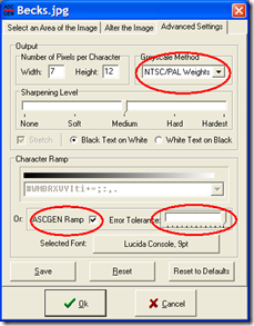
4. In the Greyscale Method section of the next tab, Choose 'NTSC/PAL Weights 2' from the dropdown list. Next, select the ASCGEN ramp checkbox, and lastly move the Error Tolerance slider bar all the way to the right as indicated.
Click on OK and the text file will be generated. Save this text file.
capture_13122008_031936
5. You'll now need to tweak this text file in MS Word to get your image right. Start by opening the text file you created in MS Word. Select all the text (CTRL+A) and set the font to Courier New. capture_13122008_032220
6. With the text still selected, reduce the font size until the entire picture fits comfortably on a single page without distorting. To quickly reduce the font size, press CRTL+SHIFT+"<" capture_13122008_032251
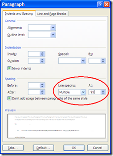
7. At this stage, you'll notice the image is slightly distorted. To fix this, select all the text, right-click it, and select Paragraph. In the Spacing section, enter a value ranging between 0.75 and 0.95 (see which value delivers the best results) in the 'To:' box and set it to 'Multiple Lines'. Try a few values until you're satisfied with the image.
Finally, save this document as a Word file, and print it using the high text quality setting in your printer.
capture_13122008_032448

The final ASCII image

Surprise your friends--I'll bet they won't be expecting these kinds of renderings of themselves! Give them their very own ASCII art image and stake your claim to being their geekiest friend. Or not.

Friday, December 5, 2008

Adobe Photoshop Lightroom 2: Portrait tricks

Good photos begin with good technique. More than having a capable camera and great equipment, it's all about mastering the nuances of composition, understanding the capabilities of your equipment, and knowing how to capture the situation and subject. But even in the best of cases, it's good to know that you can use tools that'll help you lift the quality of your image just enough to push it into 'exceptional' territory.

The capability of today's digital cameras to resolve the tiniest of details in a scene can actually be detrimental--with their multi-megapixel sensors and high-quality optics, digital SLRs are especially relentless when it comes to capturing the good and the bad in a subject. With portraits, you can capture the colored serrations in your subject's iris as easily as the blemishes on their cheeks or the discoloration in their teeth. So while some schools of thought might deem this to be cheating, I say why not use technology to flatter your subject--be it a beautiful friend, a stunning landscape, or a luscious plate of chocolate cake!

Photoshop Lightroom 2 offers a great set of tools for touching up your photos--you can be as subtle or blatant as you want. Here are some of the tools I use when it comes to portrait photography, so that I can show my subjects in the best possible light (pun intended!).

For portraits:
When it comes to touching up portraits, I use the following tools in Lightroom 2 to make a few subtle changes that can make a stunning difference. Note that I first went through the basic image correction procedures as described in my previous blog post.

capture_05122008_012557

We'll first start by analyzing the photo and determining what needs to be fixed. In the picture above, the subject has great features to start with, but there are a few tiny aspects that can be fixed including blemishes, skin oiliness, and a slight discoloration in the teeth. To add a touch of glamour, we can also impart a bit of 'glow' to the skin. Now that we know what to do, let's dive right in!

1. Spot Removal: Go to the the Develop module and hit the [N] key, or click the Spot Removal icon beneath the histogram. Next, change the size of the reticle by using your mouse scroll wheel (if present), or the box bracket keys '[' or ']'. Make this reticle slightly larger then the skin blemish you want to eliminate. Click-hold on the spot, and drag the mouse to a clear patch of skin. You'll see the clearing effect in real time--leave the mouse button when you're satisfied with the effect. Repeat this process for all spots on your subject's face. The circles in the adjoining photo represent the locations where I used spot removal. Press the 'H' key if you can't see these markers. capture_05122008_012807
2. Skin smoothening: This is perhaps one of the most powerful effects you can use for portraits. In Lightroom 2, you can use the Clarity component of the Adjustment Brush in the Develop module. Press the 'K' key to access this tool, then enable the 'Show Effect Sliders' toggle switch. Click the Effect drop-down menu and select Clarity. Now drag the Clarity slider down to about -70, and set the Flow slider to 40. Remember: the lower the Clarity slider, the greater is the effect of the skin smoothening. Flow controls the intensity of the strokes while using the tool. Remember that you can also vary the Clarity later, because it is basically a layer mask whose intensity can be changed--all thanks to the fact that effects in Lightroom 2 are non-destructive.
To use the Clarity tool, click once on the image to enable the tool, then select an appropriate brush size (as described in point 1), and 'paint' across the skin areas only. Avoid using this tool on the eyes, mouth and other facial areas that have detail, because you don't want these areas getting blurred.
capture_05122008_013514
Hold the mouse pointer over the marker to see the areas you've affected (indicated in red). To erase the effect over a particular area, press the [ALT] key and paint those areas. Use this method to bring back clarity into areas you might have mistakenly smoothened. capture_05122008_014806
3. Dental magic: Give your subject a Julia Roberts smile in a jiffy! Once again, we use the Adjustment Brush, but this time we select Saturation from the Effects drop-down list. Drag the Saturation slider down to -100, and select a nice white color from the color patch. Also, check Auto Mask.
To use the tool, click once anywhere on the teeth area to enable the tool, then select an appropriate brush size (as described in point 1), and 'paint' across the teeth areas. After you've finished, hold the mouse pointer over the marker to see the areas you've affected (indicated in red). Use the technique described above to subtract this effect if you need to.
The teeth should now look visibly brighter. Be careful not to overdo this effect--vary the flow and make sure to leave a hint of color in the teeth. Overly white teeth can look unnatural and eerie!
capture_05122008_015641
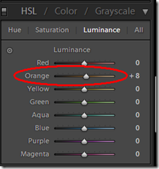
Glowing complexion: Here's a cool trick to add a hint of glow (and glamour!) to the skin. Scroll down the Develop module panel until you reach the HSL / Color / Greyscale section. Click on Luminance, and increase the Orange component to about +8. You'll see a subtle, yet visible difference!
Once again, resist overdoing it or your subject's skin just might begin to look fluorescent!
capture_05122008_020646

That's it! You should now have a much more glamorous subject. The only downside with these tweaks is the number of people who'll hound you to take their pictures, because 'your camera makes them look good'. If only they knew.

Related Posts with Thumbnails