Now that we've gone through the motions of what's required to get started with building a Web site--booking the domain and selecting a hosting provider--we're now on to the final stage of actually building the Web site! This step involves creating the HTML files that contain the site content, and link to other elements like images, downloadable files and whatever else you might want to include on your Web site.
Building a Web site can be creative, or quick-and-dirty. The path you choose depends on:
- Your skill with Web designing
- Your knowledge of Web programming
- Your access to Web design applications
- The duration you have to complete the project
Assuming you're like me, you:
- Have no formal training in Web programming or design
- Have no Web programming skills
- Are reasonably skilled with Photoshop and image editing
I know, this doesn't look like too promising a position to start at. But that's the beauty of the Internet coupled with a bit of passion--you can learn pretty much anything, and produce reasonably decent results. In my case, I embarked on my Web site building journey about a month ago while chatting with Anil, a close friend of mine who's spent the majority of his life doing some amazing work rehabilitating destitute, aged, and mentally challenged individuals. Having been doing this for over 20 years and operating on razor thin budgets, we decided that it was about time we put his Institute on the Web and make its work known to the World at large. That's when we decided to build a Web site for the Cardinal Gracias Institute.
After the idea took seed, we were completely stoked at the journey that lay ahead and dived headlong into it. In our five-step plan, we:
- Created the site map and identified the site's major sections.
- Wrote content for each of these sections and refined it until we were satisfied.
- Selected the hosting provider hours of comparing (I finally chose Host Monster).
- Went about designing and building each of the Web pages using Kompozer.
- Incorporated cool functionality (rollovers, maps and slide shows) by digging up free code snippets from online resources.
I've already covered the first three points in my earlier posts, so here I'll mention briefly about my adventures with Kompozer--an open source Web authoring tool--and touch upon other resources I used to spruce up the Web site's functionality.
If you've heard of applications like Adobe DreamWeaver and Microsoft FrontPage, Kompozer lives lower down the capability scale, but still offers enough functionality to get started with Web design.
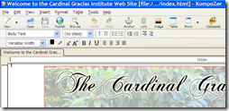
| Let's start with the application's interface. At first glance, its toolbar closely resembles a word processor with the usual buttons for adding text, images and tables, and formatting these elements. But instead of creating document files, this application generates HTML files that can be subsequently uploaded to your Web server using the built-in FTP tool. |  |
| The large area beneath the toolbar displays your Web page in one of several views: Normal, HTML Tags, Source, and Preview. You can switch between these views by clicking on the tabs at the lower left of the interface. To learn more about this application, head over here for excellent explanations on its features and functionality. |  |
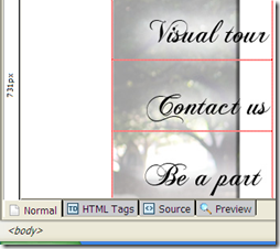
| I started building the Web site by first creating 'mock-ups' of how the key pages would look--this included the Home page, and the inner page templates. For the site design, I used a traditional header image on top, the navigation bar on the left, and a vertically scrolling content area. I took several photos when I visited the institute earlier, which I used extensively in the design. To keep all the images together, I created a table and arranged, merged and added cells to accommodate these images and text blocks on each page. You'll see the boundaries of each of the cells in the adjoining screenshot (click for a larger version). I designed these pages by studying the method described here. After creating the main home page, I simply created copies of this page and used these as starting points for the inner pages. Doing this ensured consistency. |  |
| I prepared the banner, side bar and the various photos using Photoshop, using basic Photoshop layer effects (outer glow and drop shadows). The swirly font in the main title and the side bar is 'Chopin', and is freely available. For all the images, I used 'Save for Web' (at 80 percent quality), as I found this to be the best blend of image clarity and file size. Remember that all Web elements should be as small as possible to result in the quickest page load performance. |  |
| I found a freely available Javascript code to create a rollover effect for the sidebar categories. To create these rollovers, I used two images for each of the category labels--one with the normal text, another with the outer glow effect. The Javascript code simply swaps the highlighted version with the normal version when you hover the mouse over each label. All I did was incorporate this Javascript code into the header section of the HTML pages, and make a few changes to the image references. I later stumbled upon a supposedly more elegant way to achieve this effect using the CSS method--see here for more details. |  |
| I incorporated a photo slide show in the site using the outrageously simple method of embedding a Picasa slideshow into a Web page. Using a similar approach, I also embedded a neat Google map pinpointing the location of the Institute on the 'Contact us' page. |  |
Feel free to head over to the Cardinal Gracias Institute Web site to see how these techniques took to life.
On a separate note, I'd really appreciate if you could spend a few minutes to learn more about the selfless work that Anil and his dedicated team do at the Institute. Feel free to contact him directly if you're keen on knowing more, visiting the institute, or (better still) helping out in cash or kind.


2 comments:
Hi, I used the html code for one of my slideshows from Rockyou.com. the buttons showed up but the slide show didn't! Is picaso better? thank you for you information!
bossmare
I tried the HTML code, and was able to see the standard slideshow, but was unable to view the photos when using the 'carousel' version of the code. Either way, it's tedious to add photos using this HTML code because you'll need to edit this code each time. I would definitely rate Picasa better. With Picasa, you simply add photos to your Picasa Web album, and it shows up in your slideshow. Only thing is that the Picasa logo appears in your slide show window--but it's worth it I guess.
Post a Comment